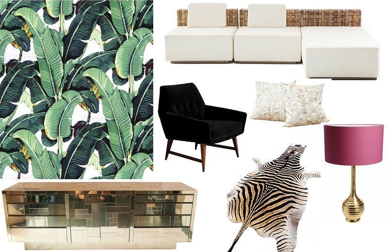
Design Focus: The Martinique Wallpaper
Share
The Martinique wallpaper is an iconic inception – an icon within an icon: The Beverly Hills Hotel. It is undoubtedly one of the nation’s well-known structures. It has a fabled history with exemplary Hollywood characters such as Fred Astaire, Marilyn Monroe, Cary Grant, Ingrid Bergman, Lucille Ball, and Charlie Chaplin to name a few. The tropical-inspired wallpaper was the brainchild of the hotel’s decorator, Don Loper, in 1942, and is now revered as one of the best design patterns. The oversized banana leaves in various hues of green, mustard, and hints of burgundy lined the walls of the hotel’s coffee shop. What makes it so grand that people can’t help but be enthralled by the overelaborate prints? The answer is quite simple and obvious: it instantly impels the sensory experience on a tropical island. We equate it with a little bit of fine R and R. Add to this fact is the calming effect of the color green. The said hue is believed to be an effective stress reducer. Common sense dictates that this type of wallpaper should only be used in wide spaces due to the very busy large-scale print. It has that constricting effect that is no-no for a cramped space such as a bathroom. Just like we mentioned in the previous post, putting rigid rules on design is passé. Don’t get us wrong though, going for the typical is still an attractive way to go. Here are some ways to make this gorgeous wallpaper work for your space:
Color Coordination and Contradiction
Earth tones agree well with the colors of the Martinique; same with monochromes and metallic such as gold. A little pop of color won’t hurt either. It will actually be an interesting take in a sea of allied hues. A striking solid color in small batches is preferable. You can either add a fuchsia lampshade or throw pillows in tangelo.
Pattern + Pattern
Combining patterns is definitely okay as long as the outcome is an organized morass. The trick is to throw in large blocks of solid colors into the mix. To avoid an interior design suicide, place the other pattern in an area that is not easily picked up by your central vision upon first glance. In the collage above, the second pattern is confined to the floor (zebra skin rug). The minimal pattern of the rug does not overwhelm the Martinique wallpaper. This is a strong coalition to consider since flora and fauna is hot on the design trend for spring/summer 2015.
Dimensions
Use the Martinique wallpaper in the small areas of your house with confidence! Contrary to popular belief, oversized prints create an appearance of a larger room, and not the other way around. It breaks up a meager equilateral space, and adds visual movement. Botanical prints such as the Martinique will look amazing in a powder room or even a home office. You can either line all the walls with this type of wallpaper or leave one wall for a floor-to-ceiling mirror with a gold frame. Larger areas of the house will benefit well from the Martinique wallpaper as well. The kitchen is not a usual space to add a dramatic wall to, but try using it in this room and prepare to be fascinated. This print clearly has a ‘made to wow’ factor attached to it.
Accent
If you prefer a played-down version of this print, you can have it as an accent wall or place it behind your bed or living room sofa. It provides an eye-catching backdrop, and can be a great headboard alternative, too. Right above the fireplace is a great space for this wallpaper. It can double as a mural or an art piece.
