Zebra Rug Decorating Mistakes That Will Make an Interior Look Cheap
Share
A zebra rug cheapening an interior? It’s quite unthinkable given that the pattern itself is synonymous with elegance and luxury.
If you peek into majority of homes inhabited by people who have fine taste in interior design, chances are, you’ll see a zebra rug or two—even a couple of furniture cloaked with the famous black-and-white print.
Why? Because adding a zebra rug can instantly transform the most mundane room into an expensive-looking one. It adds a visually sensual dimension that can be summed up in a single word: stunning.
But still, having said all that, it’s possible to make an interior look cheap if a zebra rug is not used right. So without further ado, here are the most common interior mistakes that you should avoid at all costs when adding a zebra rug into your interior mix:
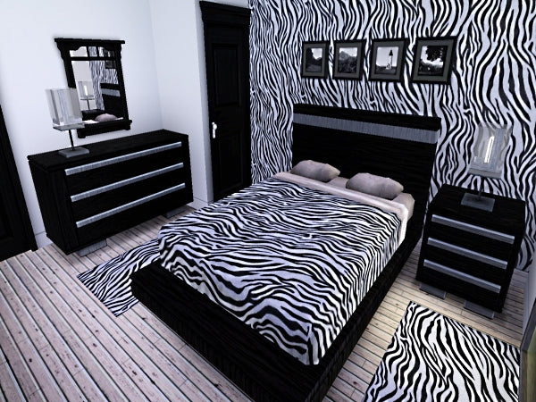
Using zebra pattern excessively

source
We get it, the pattern is truly magnificent. But filling an entire room with this single pattern is just off. Way off. We’re talking about a hodgepodge of a zebra rug, zebra pattern wallpaper, zebra beddings, zebra furniture…zebra everything! It’s a complete sensory overload.
You can do away with a couple of pieces, but not a floor-to-ceiling homage to the zebra pattern. A few decorative pillows or side tables of the same pattern won’t hurt.
Make sure to balance the scale of the pattern with solid colors. They will serve as a good visual break.
Having said that, avoid placing a zebra coffee table on top of a zebra rug. Both look wonderful on their own. But together, they become too much.
Adding non-complementary patterns
It’s A-okay to pair your zebra rug with other patterns. In fact, we’re big fans of mixing patterns. However, the additional patterns that you will use should not clash with those elegant stripes.
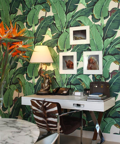
We’ll give you a visual: Martinique with a zebra pattern. Martinique is a big and busy pattern that really commands a good attention. It can easily overpower any other print; however the mixture of colors complements the zebra’s perfectly! Please see exhibit A below. Lovely, isn’t?

source
Oriental patterns (think metallic Chinoiserie) will have a healthy marriage with a zebra rug, too.
And if multiple animal prints is your thing, feel free to add another one in the room. If zebra pattern is your primary pattern in the room, then the other one should be used sparingly.
Using too many solid colors
We can’t blame anyone who has gone this route, really. The zebra pattern, after all, works well with all (yes, we’re speaking in absolutes for this one) colors. Three colors are enough. Turning a room into a bag of Skittles is too much.
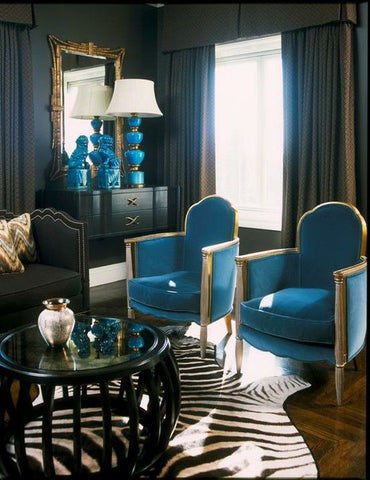
Pick a unifying color, then add a few more complementary colors to keep the space interesting. Also, make sure to distribute the weight of the complementary colors evenly just like this:

source
Conclusion
Creating an aesthetically harmonious space takes time and effort…and a good amount of research. Having a good visual of what you’re trying to achieve will help a lot, too. Create an interior mood board to see what works and what doesn’t. And if you make a mistake, don’t sweat it out. Everybody makes mistakes, even pros. Just dust it all off and start again.
