Interior Designer Focus: Nate Berkus
Share
Without a shadow of doubt, Nate Berkus holds a certain level of genius when it comes to his chosen métier: Interior Design. His level of aesthetic genius has been accentuated by his stint on Oprah, and eventually his own show, The Nate Berkus Show, which lasted for two seasons. The multi-slashy (businessman/TV personality/interior designer/author/soon-to-be father) extraordinaire is known for his quick makeover - quick and stunning! His style of fusing dated decorating with contemporary is remarkable. See some of his work below:
His quest for perfectly divergent interiors – blending various colors from different spectrum and patterns that lock horns with each other – can be seen in many of his projects. Foregoing a specific theme and collating a wide variety of furniture design makes the space visually entrancing. His style for weaving different elements together is one of his many strong points as well; countering leather with metallics or soft with something bold. Refusing to convene to a single rule is a game he plays all too well.
He is a proponent of a space being the extension of its owner. As he famously quipped “A home should be a reflection of your lifestyle and tell the story of the people who reside there over the years. As our lives evolve, so should our interiors.” The real value in his words is that an interior need not be something that was merely created for the owner solely for the sake of having an attractive home. Injecting a strong character in every home is what makes it beautiful and meaningful. The owner’s life has to be discernible from the small baubles to the totality of the interior design. The reading nook above is something that’s honed from the traditional with a little bit of elegant calibrations. A classic wood side table with weathered finish placed next to a contemporary chaise lounge chair unites to a dazzling effect.
Green, black, and gold is one of the major quadrumvirate of visual excellence in terms of hue. These colors dominate the dining room in Nate Berkus' Milan apartment inside a 1920s building. The wall is cloaked with the infamous Martinique wallpaper. The colors of the furniture are pulled from the wallpaper to avoid a big clash with the daring pattern. Though the colors of the furniture are kept solid, the texture was variegated.
An industrial space is made elegant by a pair of brass-framed chairs and marble-top end table, anchored by a zebra skin rug laid out gorgeously on the floor. The prelacy of variation over something that’s strictly analogous gives the entire look a seductive intrigue.
A very masculine vibe emanates from this Florida kitchen with oversized caged pendants by Historical Materialism. Governed by weathered metal, the rough space is softened by generous patches of wood, and strewed with colorful blooms.
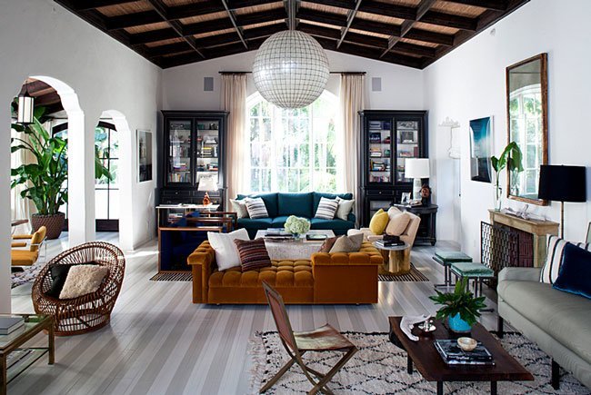
Adding black and white stripes adds immediate amount of ritz and vitality against a room full of subdued furnishing. The striped flooring abates the intimidating effect of a space with high ceiling such as the one above. Instead of creating a division by hanging chandelier in the tall living room, Nate Berkus opted for illuminating specific spots via the use of lamps in various sizes. We adore that the artwork is placed low to, again, restrict the overwhelming effect of a grand ceiling.Last but definitely not the least is the interior designer’s former Manhattan duplex family room. A large monochrome flatwoven area rug settles superbly on top of a herringbone parquet. More patterns are added such as a rhombille tiling throw pillow. The saguaro cactus skeletons leaning on the wall at the corner provides an exotic flair. Atypically perfect, don’t you think? Do share with us your favorite Nate Berkus creations! All photos are from www.nateberkus.com


